Tuesday, March 9, 2010

Hella Jongerius


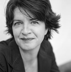
Born in 1963 in the town of De Meern, in the Netherlands, Hella Jongerius is a Dutch designer who works with many different ceramic mediums. She studied industrial design at the Eindhoven Design Academy. Droog, an influential Dutch design collective, manufactured many of Jongerius’ early designs. From 1998-1999, Hella taught at the Design Academy in Eindhoven, where from 2000-2004 she served as head of the Department of Living/Atelier. In 2000 she founded the design studio JongeriusLab in Rotterdam where she creates, produces, and markets many of her designs such as dishware, vases, textiles, and furnishings. Hella’s work blurs the border between design and handicraft, or art and technology. In addition, she fuses traditional and contemporary influences through the use of high tech and low tech, as well as the industrial and artisanal themes. This juxtaposition is what distinguishes her style from other ceramic artists.

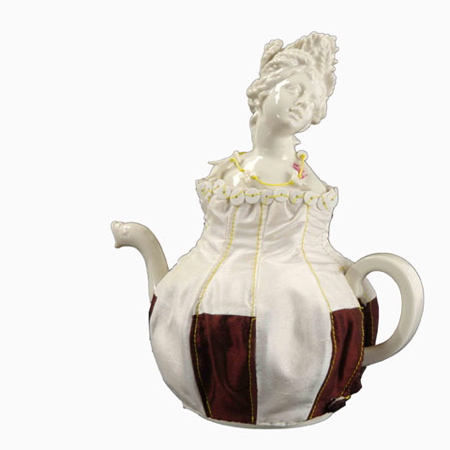
When she first became interested in art and design she started off studying carpentry. But, she came to the conclusion that carpentry was too much about “making” and not enough about creating the actual design of the object. Therefore, Hella looked to industrial design where she could deal with practical questions about work and life that bordered a profession, which was the inspiration for her work. The main theme of her work is her craft. Her goal is to find ways to make unique pieces from industrial processes and use archetypal forms through new techniques or materials. A reoccurring theme is the fusion of craftsmanship with industrialization. Much of her work deals with the relationship between modernity and traditionalism. Take this teapot (to the right) for example. The top portion of the teapot displays classical antiquity that expresses traditional elements. Whereas the cosey that encompasses the base of the pot is structured with a more industrial approach. There is a combination of craftsmanship, which is evident in the hand-made cosey, and a traditional element with the classical bust that sits atop the teapot. She tends to create a capsule that obtains information about stories and layers that add to her ceramic works.


Her work entitled Animal Bowls places greater emphasis on the manufacturers’ handcrafted products and shows the observer the numerous steps involved in finishing a product. What I love the most about this medium is the attention to detail. The animals that sit in the center of each vessel is oddly beautiful and precious in the sense that they are unexpected, but unusually functional. Both the “Unique Plates” and the bowls with animal figures are created exclusively by hand, not following defined patterns or matrices, but rather based on a system. Accordingly, no two plates are identical. They vary in size and depth and the marks left behind by the craftwork are made visible. This particular shape of the plate or the bowl is an archetypical concept that has existed for centuries and represents an attractive basis for a décor.


Reflecting on historical ceramic works, Hella creates Prince and Princess. Her choice was for two of the museum’s most highly regarded pieces: a 14th century copper-red vase from China and a 15th century cobalt blue Ming vase, which inspired her to design her Prince and Princess ceramic works. Decorative forms such as dragons and flowers on these vases were used to allow for a new pattern of openwork. Hella Jongerius translates the age-old under-glaze technique by perforating the walls in a specific decorative pattern. She then fills the holes with colored silicon rubber. In this way, the perforated vases are made waterproof.


As you can see, Hella produces a variety of works by different mediums through ceramics. It demonstrates the possibility of how far you can push a simple material like clay. Her work is extremely inspirational towards my work. I would love to emulate many of her techniques. I appreciate the simplicity of the majority of her work. She adds small, beautiful details that make her piece a gem in disguise.


Feel free to watch a YouTube video on Hella discussing her trials and tribulations of working chicle (a extremely new and challenging materials in the ceramics world). (click on "YouTube")


Sunday, March 7, 2010

Warren Mackenzie


Warren Mackenzie was born February 16, 1924 in Kansas City, Missouri. His family moved near Chicago and Warren spent his childhood growing up in Evanston, Illinois. His parents tell him he was always interested in art, but never very good at it. When he graduated from high school he decided he would become a painter and he attended the Chicago Art Institute. In 1943, in the middle of his second year at school, Warren was drafted into the army and spent three years away. He returned home from the war expecting to continue his painting education but was met with completely full courses due to all the returning GI’s. Warren searched the course catalogue and found space in a ceramic course, so he registered. His first several months learning ceramics were uneventful and he wasn’t that interested, but that all changed the day he discovered A Potters Book, by Bernard leach. Leach talked about ceramics in a utilitarian manner saying such things like, “Any person should be able to make 50 pots easily in a day’s time,” and, “Any person should be able to throw a 15-inch-tall cylinder.” Warren was sparked by Leach’s philosophy and found himself sneaking into the ceramic studio on off days to try and do the things leach said he should be able to. Later Warren Mackenzie would study under Bernard Leach as his apprentice. Warren has been practicing his career in ceramics for nearly sixty years, and has always been focused on the functionality of his work. Mackenzie has described his goal as the making of "everyday" pots, although his work is found in major museums and goes for high prices among collectors. Warren makes pots with integrity; understated and comforting; his work is often described as warm and inviting to use, as simple, casual, and dignified. As decades have passed, MacKenzie's dedication has been unwavering. He tries to keep his prices within reach with the belief that having access too, and making use of handmade objects truly does add something to one's life especially in an ever increasing mechanized world. For a while Mackenzie sold his work through the honor system, where people could walk into his gallery and take a piece while leaving the money in a basket. At 86 years old Warren Mackenzie is still making pots although he suffers from silicosis or impaired lung function.


Sunday, February 28, 2010

Liz Quackenbush!


Mouse
terracotta, majolica, lusters and glass enamel (cone 04), 2005

At first glance, the artwork of Liz Quackenbush appears whimsical, playful and cosmic. An underlying theme of nature is inherent in her forms
, which range from hand-built, frog sculptures, to colorful, floral plates and vases. As in the above Mouse, Quackenbush creates multidimensional forms, some functional and some not so functional, that are varied and dynamic and hold one's attention. According to Quackenbush, "the specific visual syntax that forms such a central part of my work is derived primarily from my own, very personal, experience of nature as an intimate part of daily life."


Star Vase

terracotta, majolica, lusters and glass enamel (cone 04), 2007


Quackenbush's recent work is primarily made from terracotta, majolica, lusters and glass enamel (cone 04). Her choice of materials is very intentional and creates the conceptual narrative of her work. Quackenbush explains that she is inspired by work from "the
medieval folk traditions of Europe and the Middle East, and the charm of 19th century Staffordshire porcelain." This is evident in the visually prominent gold luster on the Star Vase, layered on top of the majolica (which creates the whiteness of the form). The majolica is layered on the terracotta. Interestingly, her artworks are made to appear like porcelain, with light, refined qualities, but they are indeed terracotta.
While Quackenbush literally layers these materials, she is symbolically referencing the layering that exists in nature, specifically in ecosystems. She sends this theme home with the decorative content of flowers and animals.


Quackenbush plays with concepts of form and dimension, material, ornamentation, craftsmanship, tradition, and nature. It is the dynamic of her materials, technique, and forms that create beauty and intrigue in her pieces.


Dinner Plate
terracotta, majolica, lusters and glass enamel (cone 04), 2007


Quackenbush received her B.F.A. from CU in 1980. She went on to apprentice at the Moravian Pottery and Tile Works in Doylestown, PA., before going on to earn her M.F.A. at the School for American Craftsmen at Rochester Institute of Technology in Rochester, NY. She is currently a professor of art at Penn State, but she spends her summers in rural Vermont which "allowed me to produce more direct, less mediated interpretations of natural forms, and integrate this new knowledge back into the historically determined iconography of traditional ceramics that have informed my work for many years."

Liz Quackenbush, awesome ceramicist!


http://artaxis.org/ceramics/quackenbush_liz/liz_quackenbush.htm

MATT LONG


Matt Long has been a ceramic artist for 22 years. He received his Bachelor degree of fine art from The Kansas City Art Institute in 1995, before acquiring his Masters from Ohio University in 1997. His pottery tends to be cone 10 soda-fired porcelain. Aside from being a well-known ceramic artist, Matt Long is also an assistant professor at the University of Mississippi and is currently running this university's Ceramics Department.

Although I had heard about Matt Long and his work before this past summer when I was fortunate enough to take a kiln building class from him, my interest in his art was sparked after meeting him and observing his passion for functional pottery. Long’s zeal for pottery can be observed in his artist statement when he says, “hand made pottery is a complete human expression, not an interpretation of usable objects that only address a standard.” This statement is expressed in the care and thought that Long includes in the creation of his pottery. Long typically decorates his ceramic art with slips and washes that are then covered by a variety of different soda-fired glazes. Personally, I enjoy the diversity of functional-ware that Matt Long creates, which can be seen in the gallery of his personal website http://www.fullvictory.com/gallery.html.


Along with the standard functional-ware created by most potters, Long tends to make vessels such as flasks, wine bottles, and sake sets. His theme and thought behind these vessels suggests more than just alcohol consumption, something that intrigued me when listening to a lecture of his this past summer. Long expressed that his work is not about the alcohol, but instead is about the company that surrounds someone when vessels such as a flask are in use. This idea of community is also applicable to the coffee and tea pots that Long often creates and is explained in this quote from a 2004 article in Cermaics Daily (accessible for download at the bottom of this webpage http://ceramicartsdaily.org/bookstore/vessles-for-victory-by-matt-long/) “To be in the front of the cupboard, to be on the counter top, to be set on a table where someone is having a conversation with someone they care about: that matters more to me than making money or driving a better car. Maybe my flasks get passed around at a family gathering to celebrate the new year, an anniversary, or the birth of a child—events that really define who we are.”


The importance of community and the company of others is obviously a central aspect of Matt Long’s life and I believe this is his inspiration for creating the pottery that he does. As he explains, “I have a wife, two children and a dog. I have a studio to work in and I have friends around me. A lot of those things exist because of my choice about pots, about making pots and being a part of a particular kind of community.” This theme of community is reinforced by Long’s style. His tendency to use glazes and heavy slips that create curvy lines on the surface of his vessels suggesting elegance, courtliness, and class, which are not aspects that typically come to mind \when thinking of alcohol consumption.

Monday, February 22, 2010